Forums » The Lounge

New Website Layout - You Choose!

    • 1483 posts
    October 21, 2013 6:04 AM EDT

    After looking on banner for some time I think I have a few notes for banners in general. 

    1. The text should be the most prominent part of the image and be the first thing you see when you look at the image. I caught myself looking for the text a few times with the current banner.

    2. The banner should not be too complicated, with a lot of minor details and everything, but it needs to look interesting enough to catch the eye.

    3. Removing the black border is a matter of seconds and can be done at any time, so don't worry about it. Another thing to note is that the banner is not centered. There is more black space on it's left than on the right (showed with green). There is also no right border on the content below the banner (showed with red). Looks pretty shite 

    I want to ask admins to remove the 1px white border on the site content as it only limits design options, doesn't add anything to presentation and even has a negative impact on it.

    • 1483 posts
    October 21, 2013 6:05 AM EDT

    I do like the second Zimbu! It looks clear, unique and catches the eye. 

    • 1483 posts
    October 21, 2013 6:06 AM EDT

    This is a very good idea! Perhaps it will be possible to make menus appear on a compass... 

    • 622 posts
    October 21, 2013 6:09 AM EDT

    I really like that one. It's actually my main menu background.

  • October 21, 2013 6:17 AM EDT

    I tried something out with editing the black background behind the banner, and I also made the banner look more like a parchment by burning the edges, cutting out bits of it, and adding a texture:

    Is the map visible, and if so is it a good idea?

  • October 21, 2013 6:18 AM EDT

    We'll deal with the white border, don't worry about it, first let's try and get this banner and background straight.

    • 1483 posts
    October 21, 2013 6:38 AM EDT

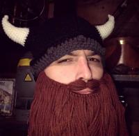
    We should have this guy on the banner, LOL 

    • 1483 posts
    October 21, 2013 7:15 AM EDT

    Is it possible to put an image as a background to the menu bar?

    • 708 posts
    October 21, 2013 7:32 AM EDT

    I think so, I had one for the one on my page before the layout was changed at some point and completely broke my page theme

    • 773 posts
    October 21, 2013 7:56 AM EDT

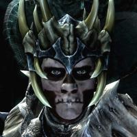
    It's probably just me but the banner put me in mind of the painting 'The Ambassadors' by Hans Holbein which hangs in the National Gallery

    The Skull in the foreground can only be properly viewed by standing on the extreme right of the painting. Its an early experiment in forced perspective

    Sorry I'll get me coat (and go to an Art Gallery to muse on my own )

    • 1483 posts
    October 21, 2013 8:09 AM EDT

    What if... the banner was transparent? Like this:

    • 1483 posts
    October 21, 2013 8:36 AM EDT

    I think the whole "stone effect" thing is unnecessary and even excessive. The easier and cleaner the text is the better... 

    • 48 posts
    October 21, 2013 8:46 AM EDT
    Yeah, I'm really liking the HUD look. Plain, simple, easy to read. Same with the parchment.

    Does my text at least look better to you now though? Trying to figure out how to fix the pixelation even if we don't use this one...
    • 1483 posts
    October 21, 2013 8:49 AM EDT

    Yes, this version is not distorted as with 1 Gaussian Blur and at the same time you really have to search for pixels to find them 

    • 1483 posts
    October 21, 2013 8:50 AM EDT

    The cool thing with this theme is that changing the backgrounds should not require banner change. So we can change them once in a while if we get bored of this one...

    • 48 posts
    October 21, 2013 8:50 AM EDT
    This is looking great. But it really shows the wasted space in the banner that I was talking about earlier. It would be great if we could reduce the physical height of the banner in this one. Bring the dragon text and the site content up closer to "The Skyrim Blog."
    • 1483 posts
    October 21, 2013 8:51 AM EDT

    I agree, it's a Ning thing though, maybe there is an option for that?

    I thought of morphing another image in that empty space but couldn't figure out what to use there... 

    • 48 posts
    October 21, 2013 8:56 AM EDT
    People keep saying that but I don't get it. Doesn't the current 200px banner push the content down? If you put a 100px banner, wouldn't it be shorter?

    There's also a blank text box in the current header (the black bar at the bottom is supposed to have text). Wouldn't putting a space in a very small font help pull that box up?
    • 739 posts
    October 21, 2013 8:56 AM EDT

    This is (yet another) great idea...

    I do think we should keep something in place for the actual banner so the page doesn't appear broken though...

    A frosted glass effect or maybe a reverse HUD theme would allow you to keep your idea without breaking the flow of the overall page...

    • 1483 posts
    October 21, 2013 8:58 AM EDT

    I think it's a fixed with box. If you put 100px banner it'll fill the remaining 100px with background color 

    • 557 posts
    October 21, 2013 8:58 AM EDT

    The text box and banner are both fixed in their height. Putting smaller images or banners there wold do nothing. 

    • 1483 posts
    October 21, 2013 8:59 AM EDT

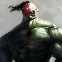
    Example of morphed image... Prepare to be tusked! 

    • 133 posts
    October 21, 2013 9:02 AM EDT

    That's a ridiculously sized mammoth 

    • 133 posts
    October 21, 2013 9:09 AM EDT

    Here's my banner again with the background slightly blurred.

    • 1483 posts
    October 21, 2013 9:12 AM EDT

    I'm not sure about this one mate... The dragon is the first thing that meets the eye and I end up searching for the blog title (a portion of a second but still)... The dragon's tail is also "snake-like" not like the tails of Skyrim dragons